Stock Market Analysis
Data
In this Project, i will analyse data of some Brazillian stocks in different market segments. The data will be extracted using pandas datareader.
We will get information for the following stocks:
- PETROBRAS(PETR4.SA): Energy segment focusing on exploring, refining and generating petroleum an its derivatives.
- Vale S.A(VALE3.SA): In raw material segment, Vale is one of the biggest mining company of the world.
- Magazine Luiza(MGLU3.SA): Big company inside retail segment.
- AMBEV(ABEV3.SA): In the consumption segment, it's the biggest ale manifacturer company of the world .
Index
- 1. What’s the change in stock’s price over time?
- 2. How a moving average will behave on these charts?
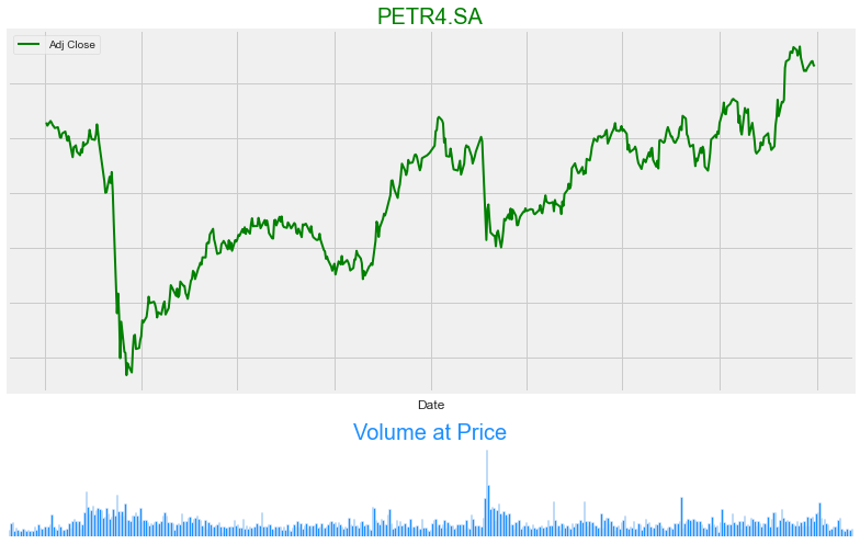
- 3. Why volume is important?
- 4. What was the daily return average of a stock?
- 5. How can we predit the price of a stock?
#Data manipulation
import pandas as pd
import numpy as np
import time

#Visual Libraries
import matplotlib.pyplot as plt
import seaborn as sns
from matplotlib import gridspec
sns.set_style('whitegrid')
plt.style.use("fivethirtyeight")
%matplotlib inline

# time series
from statsmodels.tsa.seasonal import seasonal_decompose
# ML libraries
from statsmodels.graphics.tsaplots import plot_acf, plot_pacf
from statsmodels.tsa.arima_model import ARMA
from sklearn.preprocessing import MinMaxScaler # for scaling
from keras.models import Sequential
from keras.layers import Dense, LSTM


#financial analysis
import yfinance as yf
import pandas_datareader as web
from datetime import datetime
import warnings
warnings.filterwarnings('ignore')
#data from 2 years back
end = datetime(2022, 1, 1)
start = datetime(2020, 1, 1)
#getting stock data
petr = web.DataReader('PETR4.SA', 'yahoo', start, end)
vale = web.DataReader('VALE3.SA', 'yahoo', start, end)
mglu = web.DataReader('MGLU3.SA', 'yahoo', start, end)
abev = web.DataReader('ABEV3.SA', 'yahoo', start, end)
end_timer = time.time() - start_timer

print('Done!')
Done!
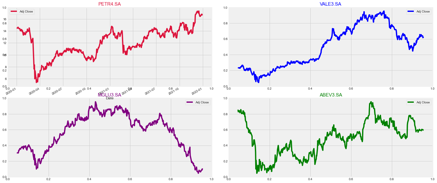
What’s the change in stock’s price over time?
rows = 2
cols = 2
fig, ax = plt.subplots(rows, cols, figsize = (20,10))
fig.tight_layout(pad = 3.0)
fig.add_subplot(221)
petr['Adj Close'].plot(color = 'crimson', legend = True)
plt.title('PETR4.SA', fontsize = '15', color = 'crimson')
#plt.axis('off')

fig.add_subplot(222)
vale['Adj Close'].plot(color = 'blue',legend = True)
plt.title('VALE3.SA', fontsize = '15', color = 'blue')
plt.axis('off')

fig.add_subplot(223)
mglu['Adj Close'].plot(color = 'purple', legend = True)
plt.title('MGLU3.SA', fontsize = '15', color = 'purple')
plt.axis('off')

fig.add_subplot(224)
abev['Adj Close'].plot(color = 'green', legend = True)
plt.title('ABEV3.SA', fontsize = '15', color = 'green')
plt.axis('off')

plt.show()
vale.describe().T
| count | mean | std | min | 25% | 50% | 75% | max | |
|---|---|---|---|---|---|---|---|---|
| High | 495.0 | 7.743830e+01 | 2.359869e+01 | 3.586000e+01 | 5.696500e+01 | 7.468000e+01 | 9.870500e+01 | 1.204500e+02 |
| Low | 495.0 | 7.531170e+01 | 2.324986e+01 | 3.245000e+01 | 5.576500e+01 | 7.115000e+01 | 9.595000e+01 | 1.152500e+02 |
| Open | 495.0 | 7.642760e+01 | 2.344576e+01 | 3.555000e+01 | 5.645500e+01 | 7.302000e+01 | 9.729000e+01 | 1.198000e+02 |
| Close | 495.0 | 7.636729e+01 | 2.343472e+01 | 3.410000e+01 | 5.633500e+01 | 7.370000e+01 | 9.745500e+01 | 1.187200e+02 |
| Volume | 495.0 | 2.879879e+07 | 1.364656e+07 | 7.831800e+06 | 2.054455e+07 | 2.594750e+07 | 3.290755e+07 | 1.825358e+08 |
| Adj Close | 495.0 | 6.147149e+01 | 2.064951e+01 | 2.547351e+01 | 4.208358e+01 | 6.380104e+01 | 7.878419e+01 | 9.728542e+01 |
How a moving average will behave on these charts?
- Let’s find out by plotting a slow(100 periods), medium(50 periods) and a quick(9 periods) moving average to see the difference.
#creating moving averages
stock_list = [petr, vale, mglu, abev]
for stock in stock_list:
    stock['ma_9'] = stock['Adj Close'].rolling(window = 9, center = False).mean()
    stock['ma_50'] = stock['Adj Close'].rolling(window = 50, center = False).mean()
    stock['ma_100'] = stock['Adj Close'].rolling(window = 100, center = False).mean()


#plottting
#slicing the data to fit the average better
#price
vale.iloc[100:]['Adj Close'].plot(figsize = (28, 8), linewidth = 3)

#averages
vale.iloc[100:]['ma_9'].plot(figsize = (28, 8), linestyle = 'dashed')
vale.iloc[100:]['ma_50'].plot(figsize = (28, 8), linestyle = 'dashed')
vale.iloc[100:]['ma_100'].plot(figsize = (28, 8), linestyle = 'dashed')
plt.title('Moving Averages on VALE3.SA', fontsize = 20, color = 'dodgerblue')
plt.legend(loc = 'upper left', fontsize = 15)
plt.axis('off')
plt.show()

Plotting Moving Averages in all stocks for better analysis
#adding moving averages to all stocks
stock_list = [petr, vale, mglu, abev]
for stock in stock_list:
    stock['ma_9'] = stock['Adj Close'].rolling(window = 9, center = False).mean()
    stock['ma_50'] = stock['Adj Close'].rolling(window = 50, center = False).mean()
    stock['ma_100'] = stock['Adj Close'].rolling(window = 100, center = False).mean()
mglu.head()


rows = 2
cols = 2
fig = plt.figure(figsize = (20, 10))
fig.tight_layout(pad = - 1.0)

#plotting all stocks
stock_names = [('PETR4.SA', 'crimson'), ('VALE3.SA', 'blue'), ('MGLU3.SA', 'purple'), ('ABEV3.SA', 'green')]
for i in range(1, 5):
    ax = fig.add_subplot(2,2,i)
    #ax.plot(stock_list[i - 1].iloc[100:][['Adj Close', 'ma_9', 'ma_50', 'ma_100']])
    ax.plot(stock_list[i-1].iloc[100:]['Adj Close'], linewidth = 2.5, label = 'Price')
    ax.legend(loc="upper left")
    plt.title(stock_names[i - 1][0], color = stock_names[i - 1][1], fontsize = 20)

    #moving averages
    ax.plot(stock_list[i-1].iloc[100:][['ma_9']], label = 'ma_9', linestyle = 'dashed', lw = '1')
    ax.legend(loc = 'upper left')

    ax.plot(stock_list[i-1].iloc[100:][['ma_50']], label = 'ma_50', linestyle = 'dashed', lw = '1')
    ax.legend(loc = 'upper left')

    ax.plot(stock_list[i-1].iloc[100:][['ma_100']], label = 'ma_100', linestyle = 'dashed', lw = '1')
    ax.legend(loc = 'upper left')
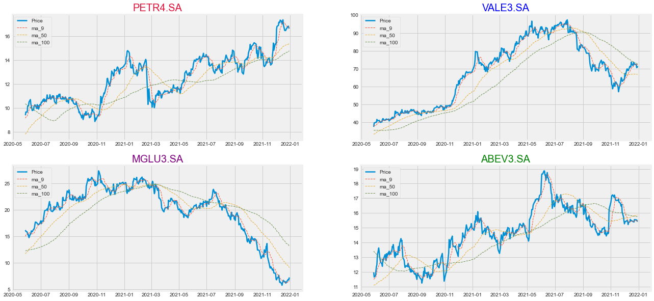
Plotting different moving averages allow us to take better reading of the price
Why volume is important?
# plot it
fig = plt.figure(figsize=(11,7))
gs = gridspec.GridSpec(2, 1, height_ratios=[4, 1])

#stock price
ax0 = plt.subplot(gs[0])
ax0.set_yticklabels([])
ax0.set_xticklabels([])
petr['Adj Close'].plot(legend = True, linewidth=2, color = 'green')
plt.title('PETR4.SA', fontsize = 20, color = 'green')

#volume
ax1 = plt.subplot(gs[1])
plt.axis('off')
petr['Volume'].plot.bar(x = vale.index.day, rot = 0, color = 'dodgerblue', stacked = False, width=1)
plt.title('Volume at Price', fontsize = 20, color= 'dodgerblue')
plt.tight_layout()
What was the daily return average of a stock.
The daily return column can be created by using the percentage change over the adjusted closing price
vale['Daily Return'] = vale['Adj Close'].pct_change()
vale['Daily Return'].plot(figsize =(15, 5), legend=True, linestyle = '--', marker = 'o', color = 'dodgerblue')
plt.title('VALE3.SA Daily Returns', fontsize = 20)
plt.show()

sns.histplot(x=vale['Daily Return'].dropna(),bins=100,color='crimson')
plt.xlim(-0.10, 0.10)
plt.show()
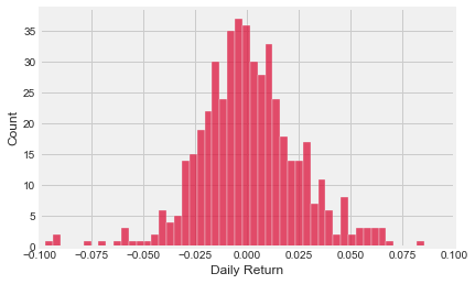
Positive daily returns seem to be more frequent for Vale.
Checking Correlations between stock returns.
#Reading just the 'Adj Close' column from stocks this time
stock_list = ['PETR4.SA', 'VALE3.SA', 'MGLU3.SA', 'ABEV3.SA']
close_df = web.DataReader(stock_list,'yahoo',start,end)['Adj Close']
close_df.tail()
| Symbols | PETR4.SA | VALE3.SA | MGLU3.SA | ABEV3.SA |
|---|---|---|---|---|
| Date | ||||
| 2021-12-23 | 16.556160 | 72.463844 | 6.20 | 15.55 |
| 2021-12-27 | 16.801609 | 72.280739 | 6.78 | 15.53 |
| 2021-12-28 | 16.819141 | 70.541252 | 6.83 | 15.52 |
| 2021-12-29 | 16.678885 | 70.724350 | 6.76 | 15.45 |
| 2021-12-30 | 16.626287 | 71.374374 | 7.22 | 15.42 |
returns_df = close_df.pct_change()
returns_df.tail()
| Symbols | PETR4.SA | VALE3.SA | MGLU3.SA | ABEV3.SA |
|---|---|---|---|---|
| Date | ||||
| 2021-12-23 | 0.006037 | -0.009635 | 0.006494 | 0.010396 |
| 2021-12-27 | 0.014825 | -0.002527 | 0.093548 | -0.001286 |
| 2021-12-28 | 0.001043 | -0.024066 | 0.007375 | -0.000644 |
| 2021-12-29 | -0.008339 | 0.002596 | -0.010249 | -0.004510 |
| 2021-12-30 | -0.003154 | 0.009191 | 0.068047 | -0.001942 |
Let’s create a scatterpltlot to visualize any correlations between the stocks we’re analyzing.
- First we’ll visualize a jointplot for the relationshop between the daily return of a stock to itself.
sns.jointplot('VALE3.SA', 'VALE3.SA', returns_df, kind = 'reg', color = 'orangered')
<seaborn.axisgrid.JointGrid at 0x1db476cc370>
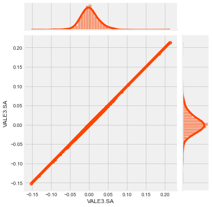
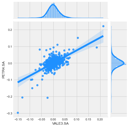
As expected, the relationship is perfectly linear because we’re trying to correlate something with itself. Now, let’s check out the relationship between VALE3.SA and PETR4.SA daily returns.
How jointplot works
- A joint plot provides a concise way to understand both the relationship between two variables aswell as individual distrubution o each variable.
- The middle figure stands for the relationship plot. It shows how y and x are related.
- The histogram above shows how the X distrubution looks like.
- The histogram on the right shows how the Y distrubution looks like.
-
The upper and right plots together gives us a sense of what the marginal distribution look like from both x and y.
sns.jointplot('VALE3.SA', 'PETR4.SA', returns_df, kind = 'reg', color = 'dodgerblue')
<seaborn.axisgrid.JointGrid at 0x1db58b16310>
sns.pairplot(returns_df.dropna(), kind = 'reg')
<seaborn.axisgrid.PairGrid at 0x1db572d3250>
How pairplot works
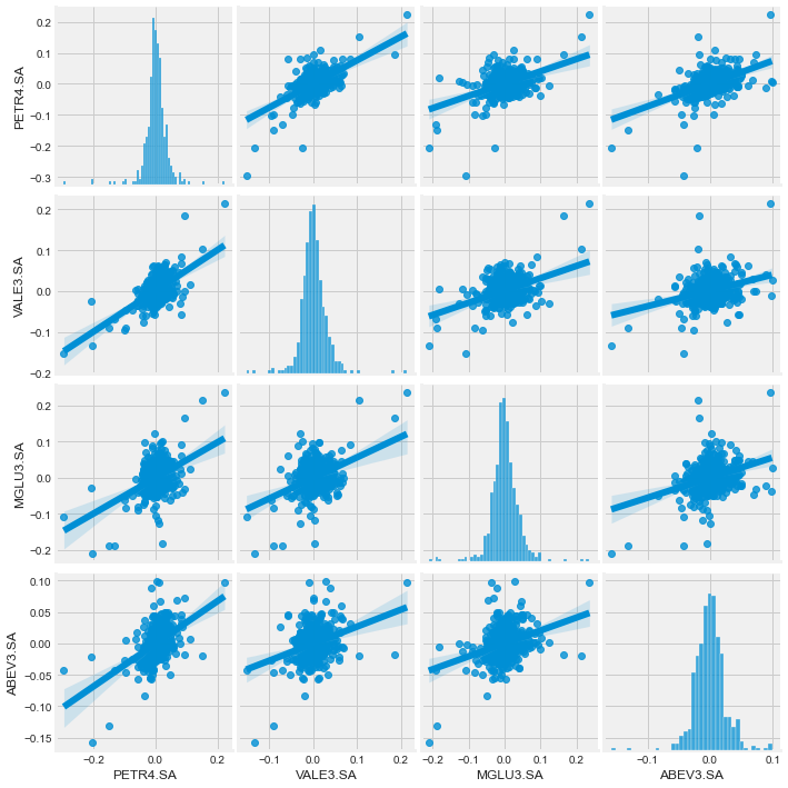
- Pairplot helps to detect correlations between all the columns of the dataset.
- It works like a grid, plotting the X-axis against Y-axis creating multiple plots.
- Since the dataset we’re plotting has 4 measurements, it creates a 4 x 4 grid plot.
How can we predit the price of a stock?
# Using Petrobras stock as an example
df = web.DataReader('PETR4.SA', data_source = 'yahoo', start = '2012-01-01', end = datetime.now())
df['Close'].plot(figsize = (16, 5))
plt.title('Closing Price for Petrobras', fontsize = 25)
plt.show()

Data Pre-processing
- First we need to treat the column which the model will be trained.
- The column will be the one containing the close price.
- After that, a conversion from dataset to numpy array is needed to get only the values.
- Then we select the training portion (95% of the entire data) to train the model.
# storing only the close price
close = df.filter(['Close'])

# converting the dataframe into numpy arrays
close_values = close.values

# using 95% of the stock data to train the model
training_data_len = int(np.ceil(len(close_values) * .95))

training_data_len
2573
- Now, a scaled conversion type is needed for faster and better training.
- The dataset where the data points or features values have high difference with each other will require more time for the model to understand the data and the accuracy will be lower.
- Scaling the difference interval between 0 and 1 will make things easier to work.
# Scaling the data first
scaler = MinMaxScaler(feature_range = (0,1))
scaled_data = scaler.fit_transform(close_values)

scaled_data
array([[0.52297133],
       [0.54325773],
       [0.548031  ],
       ...,
       [0.60143198],
       [0.63186153],
       [0.65334128]])
Train and Test data.
# Create the training data set
# Create the scaled training data set
train_data = scaled_data[0:int(training_data_len), :]
# Split the data into x_train and y_train data sets
x_train = []
y_train = []

for i in range(60, len(train_data)):
    x_train.append(train_data[i-60:i, 0])
    y_train.append(train_data[i, 0])
    if i<= 61:
        print(x_train)
        print(y_train)
        print()

# Convert the x_train and y_train to numpy arrays
x_train, y_train = np.array(x_train), np.array(y_train)

# Reshape the data
x_train = np.reshape(x_train, (x_train.shape[0], x_train.shape[1], 1))
# x_train.shape
[array([0.52297133, 0.54325773, 0.548031  , 0.54027443, 0.5408711 ,
       0.54982096, 0.55787587, 0.5581742 , 0.5632458 , 0.56235079,
       0.58025057, 0.58025057, 0.60173032, 0.59695699, 0.59725533,
       0.6244033 , 0.6324582 , 0.61813841, 0.61068017, 0.60769687,
       0.60769687, 0.61903342, 0.60650358, 0.60889021, 0.61634845,
       0.63842481, 0.63335321, 0.63544151, 0.57577564, 0.57577564,
       0.56712406, 0.56384248, 0.58711213, 0.59218373, 0.58830547,
       0.6050119 , 0.60113364, 0.60053697, 0.5999403 , 0.61694506,
       0.6294749 , 0.60829354, 0.58323387, 0.59009543, 0.59337707,
       0.58204053, 0.57368734, 0.60352028, 0.61545344, 0.59725533,
       0.60113364, 0.60113364, 0.59874701, 0.59397375, 0.59397375,
       0.58174225, 0.59695699, 0.5847255 , 0.572494  , 0.5704057 ])]
[0.5713007090050437]

[array([0.52297133, 0.54325773, 0.548031  , 0.54027443, 0.5408711 ,
       0.54982096, 0.55787587, 0.5581742 , 0.5632458 , 0.56235079,
       0.58025057, 0.58025057, 0.60173032, 0.59695699, 0.59725533,
       0.6244033 , 0.6324582 , 0.61813841, 0.61068017, 0.60769687,
       0.60769687, 0.61903342, 0.60650358, 0.60889021, 0.61634845,
       0.63842481, 0.63335321, 0.63544151, 0.57577564, 0.57577564,
       0.56712406, 0.56384248, 0.58711213, 0.59218373, 0.58830547,
       0.6050119 , 0.60113364, 0.60053697, 0.5999403 , 0.61694506,
       0.6294749 , 0.60829354, 0.58323387, 0.59009543, 0.59337707,
       0.58204053, 0.57368734, 0.60352028, 0.61545344, 0.59725533,
       0.60113364, 0.60113364, 0.59874701, 0.59397375, 0.59397375,
       0.58174225, 0.59695699, 0.5847255 , 0.572494  , 0.5704057 ]), array([0.54325773, 0.548031  , 0.54027443, 0.5408711 , 0.54982096,
       0.55787587, 0.5581742 , 0.5632458 , 0.56235079, 0.58025057,
       0.58025057, 0.60173032, 0.59695699, 0.59725533, 0.6244033 ,
       0.6324582 , 0.61813841, 0.61068017, 0.60769687, 0.60769687,
       0.61903342, 0.60650358, 0.60889021, 0.61634845, 0.63842481,
       0.63335321, 0.63544151, 0.57577564, 0.57577564, 0.56712406,
       0.56384248, 0.58711213, 0.59218373, 0.58830547, 0.6050119 ,
       0.60113364, 0.60053697, 0.5999403 , 0.61694506, 0.6294749 ,
       0.60829354, 0.58323387, 0.59009543, 0.59337707, 0.58204053,
       0.57368734, 0.60352028, 0.61545344, 0.59725533, 0.60113364,
       0.60113364, 0.59874701, 0.59397375, 0.59397375, 0.58174225,
       0.59695699, 0.5847255 , 0.572494  , 0.5704057 , 0.57130071])]
[0.5713007090050437, 0.5677207318516879]
LSTM(Long Short term Memory) Networks.
- Model that uses RNN(Recurrent Neural Networks).
- RNN are networks with loops in them, allowing information to persist.
- LTSM are a special kind of RNN, capable of learning long-term dependencies.
- All recurrent neural networks have the form of a chain of repeating modules of neural network.
More detail at https://colah.github.io/posts/2015-08-Understanding-LSTMs/
Model Structure
# Building the LSTM network
model = Sequential()
model.add(LSTM(128, return_sequences = True, input_shape = (x_train.shape[1], 1)))
model.add(LSTM(64, return_sequences = False))
model.add(Dense(25))
model.add(Dense(1))

#compiling the model
model.compile(optimizer = 'adam', loss = 'mean_squared_error')

#training the model
model.fit(x_train, y_train, batch_size = 1, epochs = 1)
2513/2513 [==============================] - 62s 23ms/step - loss: 0.0016


<keras.callbacks.History at 0x1db4a0f2df0>
# Creating the testing dataset
test_data = scaled_data[training_data_len - 60 :, : ]
x_test = []
y_test = close_values[training_data_len: , : ]

for i in range(60, len(test_data)):
    x_test.append(test_data[i -60: i, 0])

# converting the data into a numpy array
x_test = np.array(x_test)

# Reshaping the data
x_test = np.reshape(x_test, (x_test.shape[0], x_test.shape[1], 1))

# get the model's predicted price values
predictions = model.predict(x_test)
predictions = scaler.inverse_transform(predictions)

# getting the rootmean squared error (RMSE)
rmse = np.sqrt(np.mean(((predictions - y_test) ** 2)))
rmse
5/5 [==============================] - 1s 16ms/step


1.3543787493808783
Final Results
# Plotting the data
train = close[:training_data_len]
valid = close[training_data_len:]
valid['Predictions'] = predictions

# plotting the results
plt.figure(figsize = (18, 6))
plt.title('LSTM Price Prediction')
plt.xlabel('Date', fontsize = 18)
plt.ylabel('Close Price', fontsize = 18)
plt.plot(train['Close'])
plt.plot(valid[['Close', 'Predictions']])
plt.legend(['Train', 'Val', 'Predictions'], loc = 'lower right')
plt.show()

# Showing the valid predicted prices
valid
| Close | Predictions | |
|---|---|---|
| Date | ||
| 2022-05-19 | 34.169998 | 34.140266 |
| 2022-05-20 | 34.830002 | 34.092289 |
| 2022-05-23 | 36.200001 | 34.425396 |
| 2022-05-24 | 31.600000 | 35.315041 |
| 2022-05-25 | 32.049999 | 33.924923 |
| ... | ... | ... |
| 2022-11-24 | 24.250000 | 25.177732 |
| 2022-11-25 | 23.860001 | 24.860178 |
| 2022-11-28 | 24.360001 | 24.774265 |
| 2022-11-29 | 25.379999 | 25.024622 |
| 2022-11-30 | 26.100000 | 25.697630 |
135 rows × 2 columns
Full code HERE